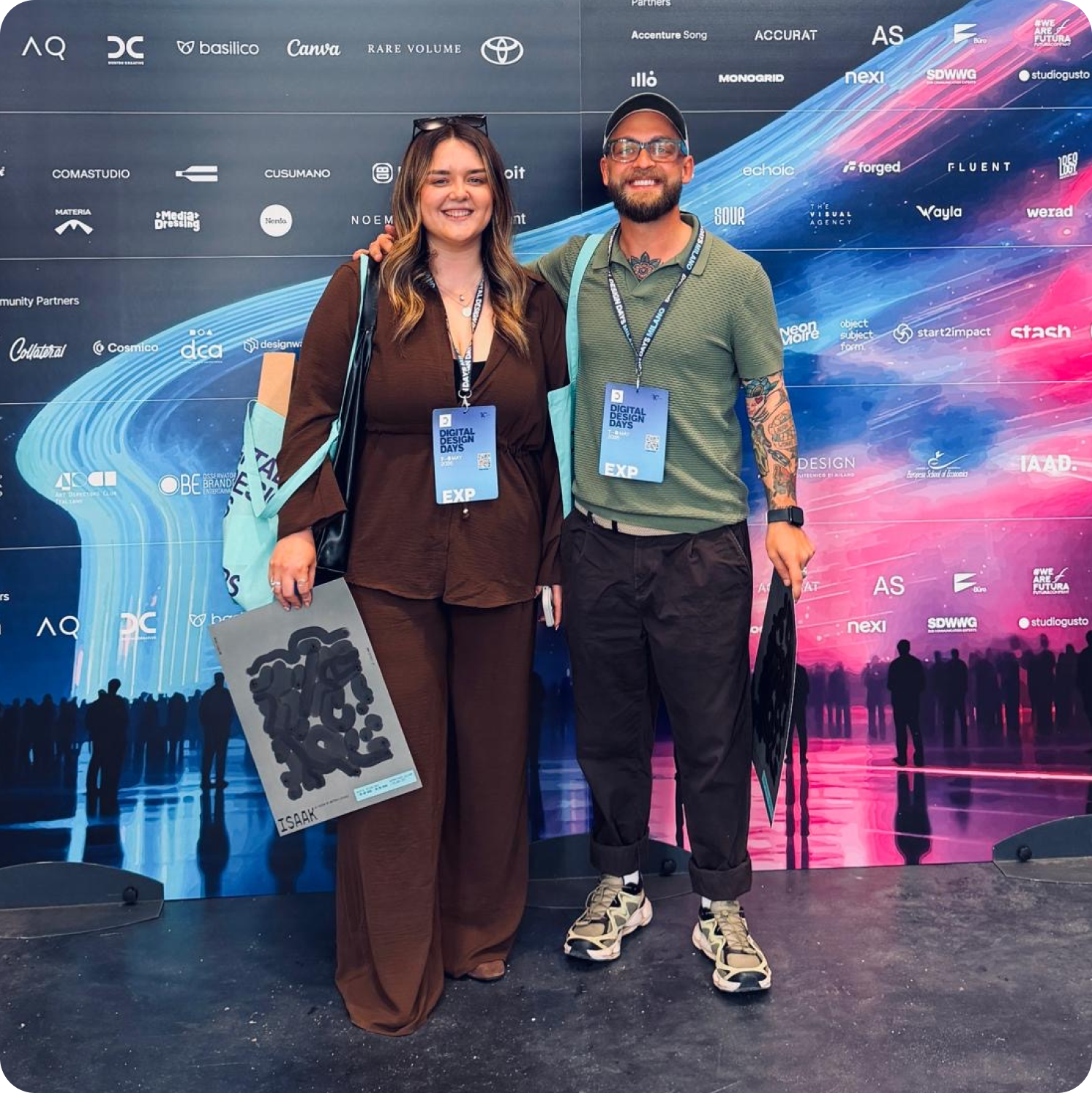
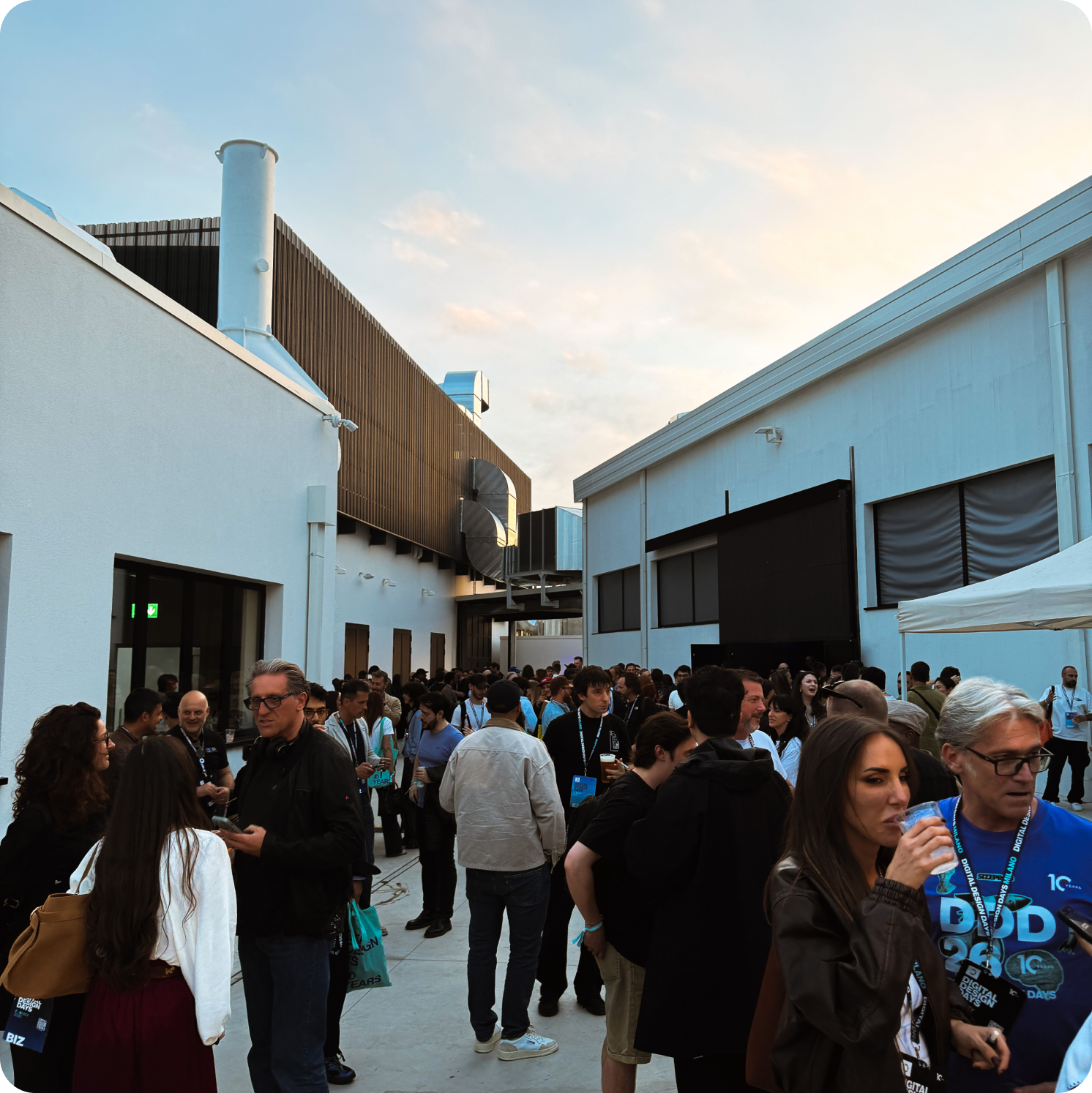
Leon and I spent three days at Digital Design Days in Milan, and we’ve come back with full notebooks, a sharpened point of view, and an inconvenient number of opinions about what was the best spritz, Hugo or Aperol?
What follows is a day-by-day account of what stuck, the talks, the moments, and what we think it means for our design team and for Atomic as a consultancy.
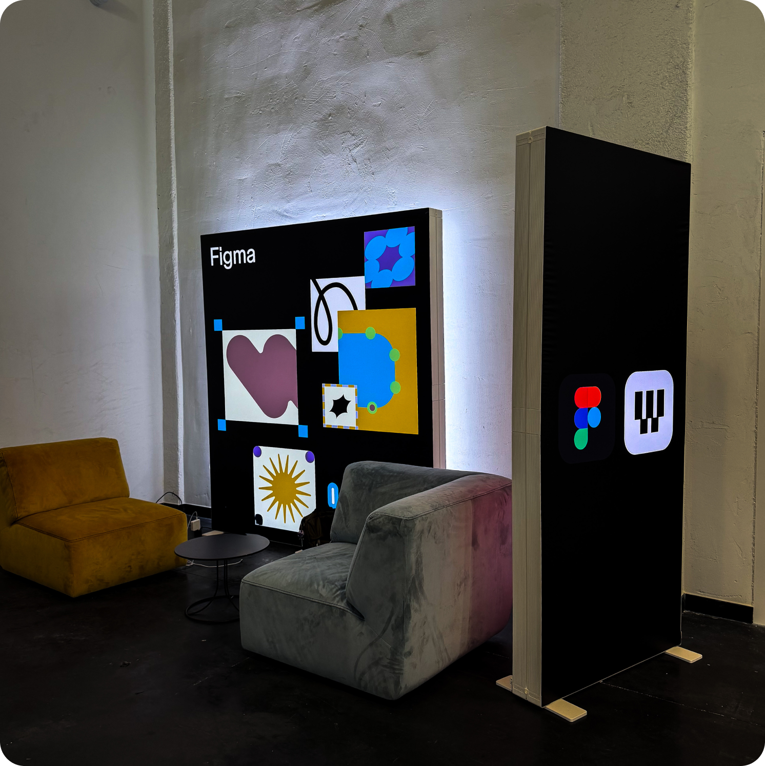
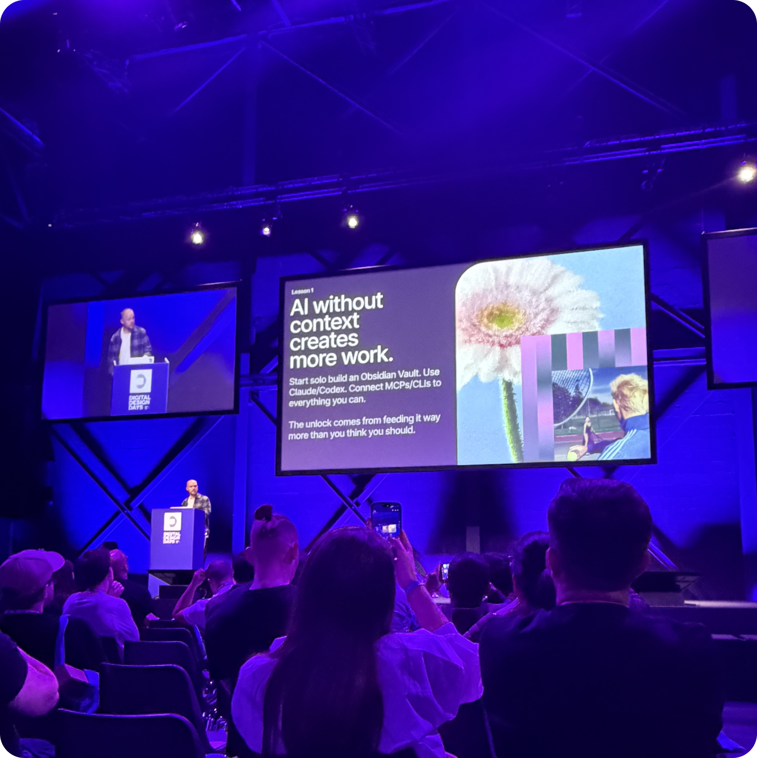
If there was a theme to day one, it was the quiet, slightly uncomfortable acknowledgement that the role of the designer is shifting underneath us, and the people who’ll thrive are the ones leaning into it.
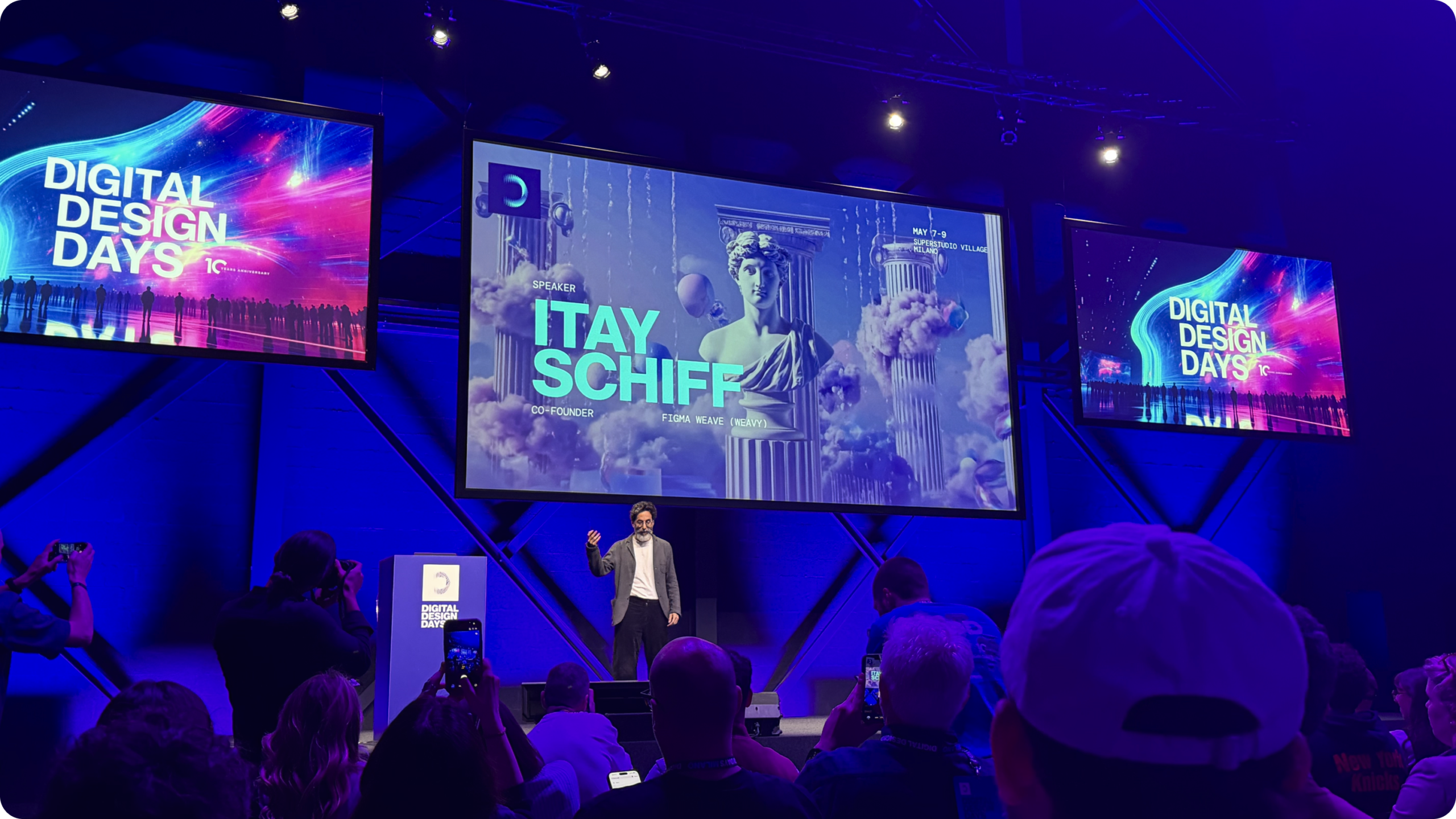
Itay Schiff from Figma Weave kicked things off with a reframe that felt overdue: the designer as curator rather than creator. In a world where generating things is increasingly trivial, the craft moves upstream, into taste, judgment, and knowing what to keep, push, or kill. He showed how Figma Weave fits into existing workflows to support that, rather than replacing the thinking with a generator.
Leon put it well over coffee afterwards: “It’s not that the craft is gone, it’s that it’s moved. The hard part used to be making the thing. Now the hard part is choosing the right thing to make.”

Daan Klaver from Build in Amsterdam followed with a talk on consistency that managed to make a famously dry topic feel urgent. His underlying point: consistency is what allows trust to compound. Without it, even beautiful work starts to feel unreliable.
Gabriele Rossi from Accurat then made the most provocative argument of the day. When AI can generate code, visuals and prototypes on demand, the value of a designer isn’t in the artefact, it’s in the clarity of construction. Static deliverables decay the moment they’re finished. The shift from maker to conductor is where the real opportunity sits. “Stop selling hours, start selling judgment” was the line that landed for both of us.
Claudio Gasparollo and Irene Costantini from Ditroit brought the day’s most joyful energy. Their argument: protect space for personal projects and unbriefed experimentation, or your work starts going “musty”, a perfect description for something every creative has felt at some point. They also brought ISAAK, a collaborative robot that sketches an abstracted portrait of you in real time, on paper, with its own hands. Not a reproduction, an interpretation. A genuinely lovely thing to witness.
Philip Maggs from Superside closed the day with the Brand Brain, a living system that captures not just brand guidelines but the thousand small judgement calls that actually define what on-brand means in practice. Leon noted, “Every brand guidelines PDF I’ve ever opened goes out of date the moment it’s published. This actually addresses why.”

For our design team:
For Atomic as a consultancy:
Day two was the day craft fought back.
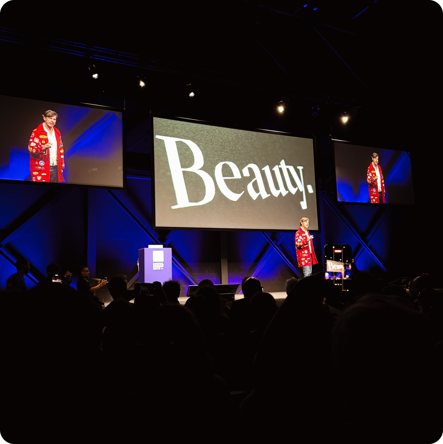
Stefan Sagmeister from Sagmeister & Walsh opened with a keynote we’d both been buzzing for since the schedule dropped. His work shaped a huge chunk of Leon’s dissertation, and his New York studio was somewhere he once tried (and spectacularly failed) to land a placement at. Seeing him in person did not disappoint either of us.
His argument: beauty isn’t decoration. It’s a functional property of design that genuinely moves people, shapes decisions, and improves wellbeing. When work is truly beautiful, it doesn’t need explaining, it lands. I left that keynote remembering why I got into design in the first place.
Mason Nicoll from Digital Kitchen was, honestly, one of the best presenters either of us has seen in long time. Emmy-winning work spanning Harry Potter: Visions of Magic, HBO’s Westworld, and pieces in MoMA’s permanent collection. What made it special was the how: vintage radioactive lenses, hand-painted techniques, decisions rooted in craft and narrative rather than trend. Work that feels human-made because it is.
Clive K. Lavery gave the bravest talk of the conference, The 7 Habits of Highly Depressive Designers. Lived experience with depression, an unflinching look at the patterns that burn creative people out, and a reminder that the culture you build around the work matters as much as the work itself.
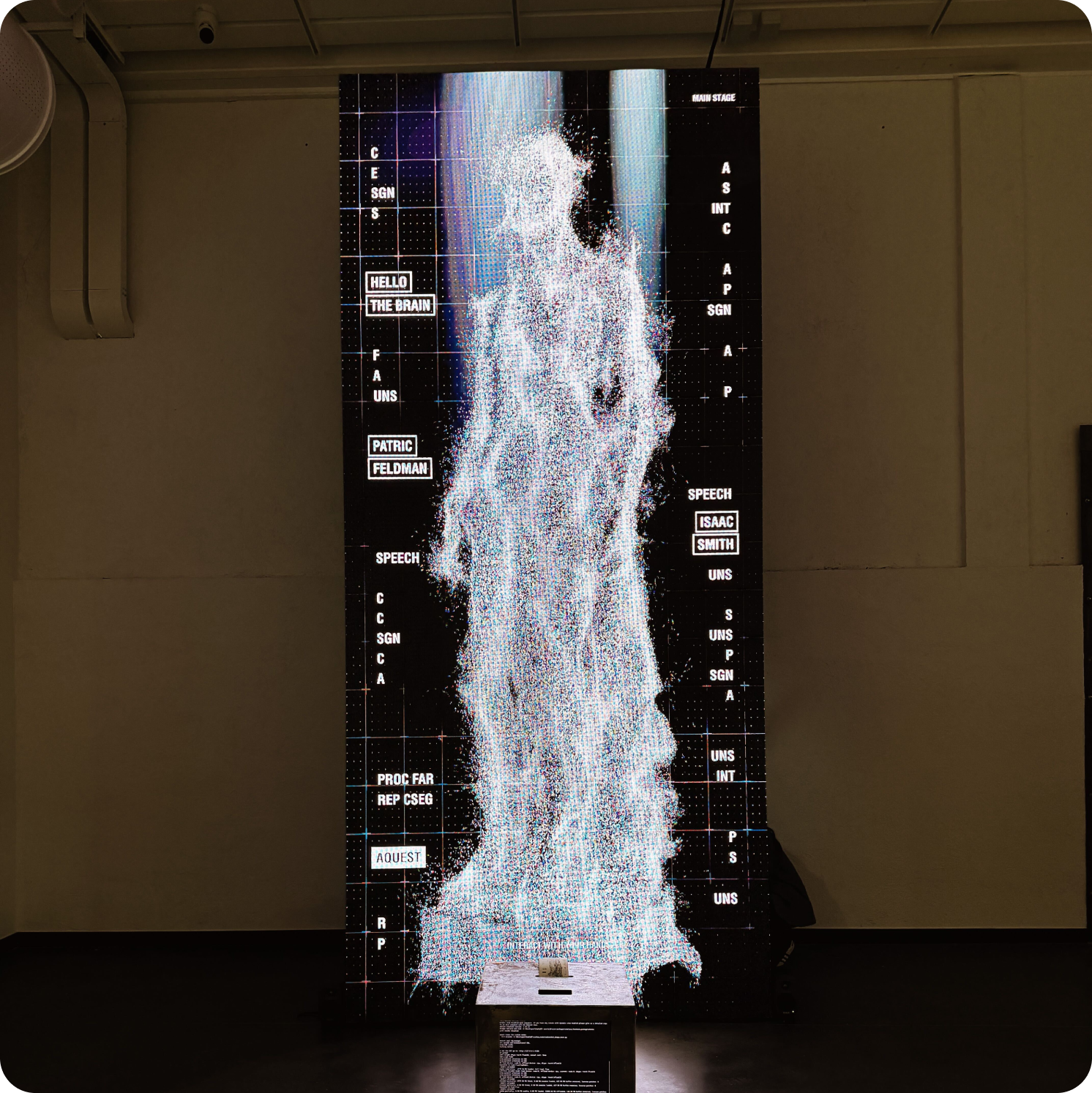
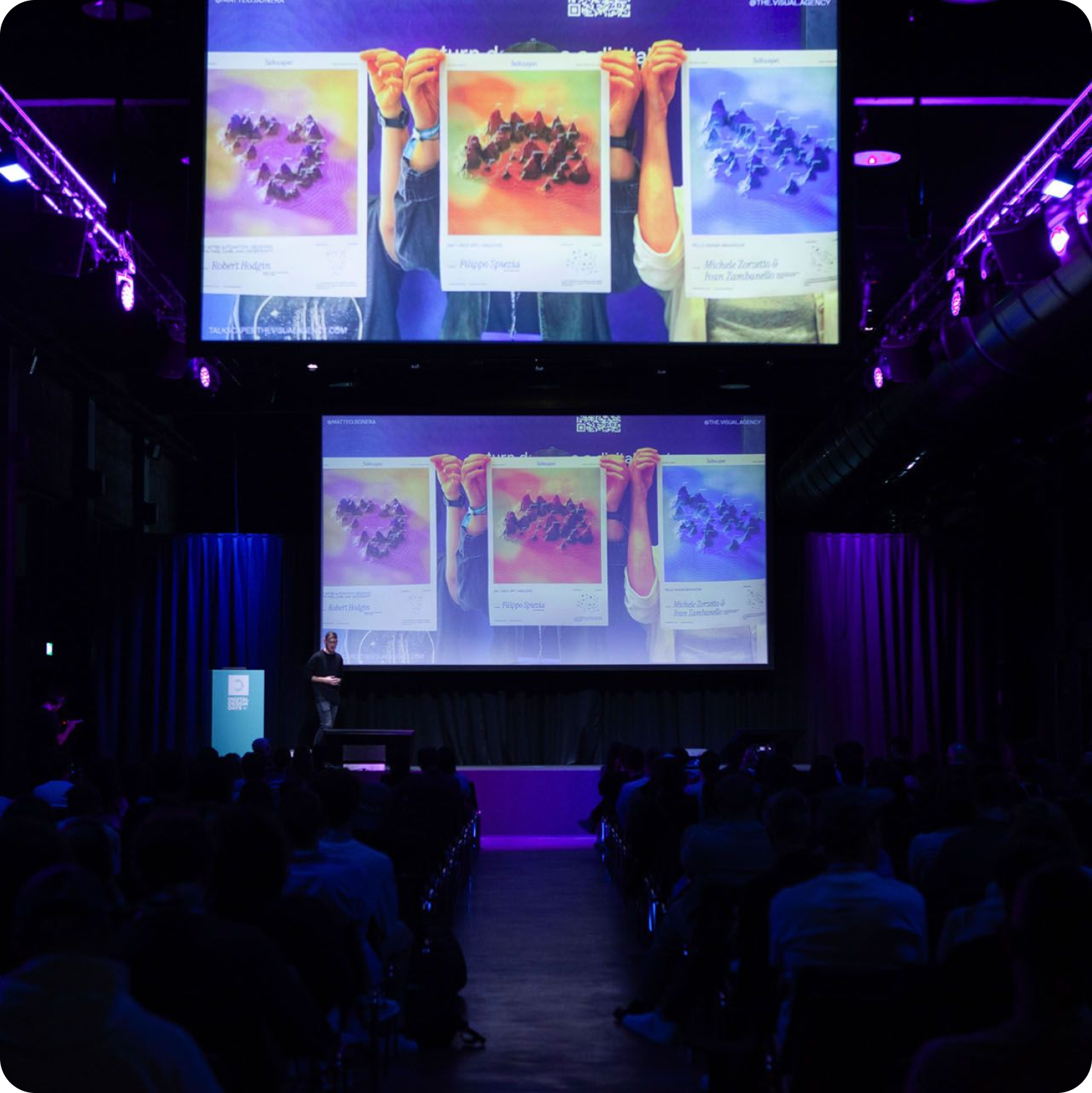
The day closed with an installation from The Visual Agency called What if a talk left a visible trace? Speech, connections and reactions captured in real time and translated into a generative poster as the day unfolded. Language into data, data into form. Every poster unique. Quietly, one of the most beautiful things at the whole event.
For our design team:
For Atomic as a consultancy:
The final day pulled the threads together.
Marina Willer from Pentagram made a confident case that, in the age of AI, human insight is more valuable than ever, not less. Drawing on her work for Rolls-Royce, Tate, Amnesty International, and her filmmaking (Red Trees premiered at Cannes), she argued that creativity is a mindset of experimentation. Technology generates options; only creativity decides which ones are worth pursuing. “Crossing disciplines keeps the work fresh,” she said, and you could feel a room full of designers quietly resolving to take up something new on Monday morning.
Dilshan Arukatti from Immersive Garden spoke from the studio-owner trenches: how to build something that creates real impact without chasing trends. His work for Louis Vuitton, Cartier, Audemars Piguet and Dior is the proof point. His framing, lasting value over temporary noise, felt directly relevant to where Atomic is heading.
Valeria Moreiro from Not Real closed it out for us. Her definition of creativity wasn’t about beautiful art or trend-chasing, it was about mixing ideas, references and disciplines, taking thoughtful risks, and building meaningful solutions inside the real constraints of briefs, budgets and time. “Creativity is born from limitation,” she said. Problems aren’t interruptions, they’re part of the creative act.
As Leon summed it up on the walk back: “The constraints aren’t getting in the way of the work. They are the work.”
For our design team:
For Atomic as a consultancy:
Across three days, fifteen-plus talks and one quietly brilliant generative poster, the same point kept surfacing: AI isn’t replacing designers, it’s redistributing where the value sits. The artefact is no longer the prize. Taste, judgement, craft, beauty, consistency, culture and clarity are.
The studios and consultancies that thrive over the next few years will be the ones that lean into that shift rather than resisting it. That’s the bet Atomic is making, and three days in Milan only made us more sure of it.
Plus, the pizza, pasta and of course the Aperol spritz were excellent. Worth the trip on its own merits.
There’s a moment every designer knows – that quiet “ahh, they nailed it” when a product just flows. Every touchpoint feels intentional, every pixel has purpose, and you’re moving with the interface, not against it. And then, there are the others – the ones that feel like they were designed by a committee who last met in 2021 on a Friday at 4:55 PM. The real difference between design nirvana and UX purgatory rarely comes down to aesthetics. It’s about mindset – the principles guiding every decision from concept to launch.
Here are five must-haves that take a product to design heaven – and five sins that send it straight to UX hell.
If users need a manual, the design has already failed. Great design doesn’t need explaining – it explains itself. When something is designed with clarity, it feels intuitive from the first interaction. Think of Notion’s blank canvas: unassuming, adaptable, and clear in its intent. Clarity lives at the intersection of simplicity and purpose – the essence of Dieter Rams’ “good design is as little design as possible.” Every flourish should earn its place. A practical way to test for clarity is the ‘one-glance test’: show your product to someone unfamiliar and ask what it does in five seconds. If they can’t tell you, simplify. Then simplify again.
Design systems aren’t creative constraints – they’re the backbone of trust. Consistency across touchpoints tells users, “you’re in good hands”. From iconography and motion to tone of voice, coherence creates comfort and eliminates the “why does this button look different again?” chaos. Airbnb’s Design Language System set the tone for a generation of digital brands by unifying layout, voice, and interaction into one identity. Google’s Material Design turned consistency into craft. When done right, consistency becomes invisible – when done wrong, it feels like someone changed the rules mid-game.
Beautiful design is easy; purposeful design is hard. Interfaces can look stunning yet still feel cold or confusing. True design goes beyond visuals – it’s empathy made tangible. The best products are built with users, not just for them. Headspace, for example, infused calm into every detail, from its color palette to its micro-interactions, understanding that design shapes emotion as much as behavior. Empathy also means inclusion. Accessibility, readability, and diversity aren’t “nice-to-haves”; they are the foundation of humane digital experiences. A product that excludes is a product that fails, no matter how elegant it looks.
Great design is never a solo act. The most successful products emerge from cross-functional collaboration, not isolated effort. Designers, engineers, researchers, and product managers work best when aligned from day one – not when ideas are handed off like hot potatoes. Figma itself was born from this principle: built to solve the pain of fragmented workflows between teams. When collaboration happens early and often, friction disappears and creativity accelerates.
Design isn’t a finish line; it’s a feedback loop. The best teams treat launch day as version 0.1, not the final destination. They ship, listen, learn, and evolve. Duolingo’s growth came not from a single stroke of genius but from continuous, data-driven iteration. Every A/B test, heatmap, and user complaint offers insight – frustration is simply feedback in disguise. Each cycle of improvement brings the product closer to what users actually need. Feedback isn’t failure; it’s progress.
Welcome to the dark art of alignment meetings, where compromise disguises itself as collaboration. What begins as a clean, purposeful concept often mutates into a Frankenstein interface – stitched together from every ‘small tweak’ and ‘quick thought’ along the way. True leadership isn’t about everyone having a say; it’s about everyone understanding who owns the why. Great design isn’t democratic – it’s directional. Designers need the trust and autonomy to make informed, research-led decisions, not politically safe ones. Feedback should refine ideas, not dilute them. The best teams know when to invite critique and when to close the Figma file. Data-led conviction will always beat design by consensus.
If clarity is king, feature creep is the court jester. It starts with a focused product and one innocent suggestion: “What if we just added…” Before long, the vision blurs and the interface bloats. Apple’s first iPhone shipped without copy-paste or an app store – because focus always beats feature lists. MVP doesn’t mean barely functional; it means purposefully focused. Simplicity isn’t a lack of ambition – it’s discipline. Focus can’t be designed; it has to be defended.
Instincts are valuable, but untested intuition can be dangerous. Design thrives where empathy meets evidence. Data doesn’t exist to control creativity – it exists to inform it. Tools like Maze, Mixpanel, or Hotjar don’t tell designers what to build; they reveal where users struggle, succeed, or drop off. When the numbers highlight friction, the goal isn’t to defend the design but to understand the ‘why’. Without data, design becomes guesswork, but used wisely, data sharpens intuition – it doesn’t silence it.
“We’ll fix it in v2” is the UX equivalent of “I’ll start exercising next week.” Speed matters, but trust matters more. Shipping fast shouldn’t mean shipping unfinished. A sloppy MVP might win a demo, but it won’t earn loyalty. Slack’s onboarding is a perfect example – minimal, frictionless, but complete from day one. A true MVP delivers value immediately, not eventually. Launch lean, not lazy.
When accessibility, readability, or inclusion become afterthoughts, the design has already failed. The goal isn’t to design for the average – it’s to design for everyone. Accessibility and usability are not optional enhancements; they are the ethical foundation of good design. Apple’s VoiceOver and Microsoft’s Adaptive Controller both prove the same truth: accessibility and beauty aren’t opposites. They are simply design done right.
It’s what happens when the team stops asking why and starts designing for deadlines instead of delight.
The path to good design is clear: approach every decision with empathy, build with clarity, and test with humility. Every choice nudges a product closer to one side or the other, and in this industry, every Jira ticket carries the potential for redemption or damnation.
If you’re ready to elevate your product and move closer to design heaven, contact the design team at Atomic today at [email protected]. Let’s build with purpose, clarity, and empathy – together.
The European Accessibility Act (EAA) comes into force in June 2025, and it’s set to reshape how digital services operate across the EU. For organisations, this isn’t just another checklist for compliance, it’s a fundamental opportunity to create better, more inclusive experiences for everyone.
Aligning and cross-referencing our work with the Web Content Accessibility Guidelines (WCAG 2.1) has always been an integral part of our design process, and the EAA provides an opportunity to escalate our accessibility standards even further. At Atomic, we believe great design should work for everyone. With our UX Auditing and Accessibility Design Services, we help organisations to futureproof not just to meet the legal standard, but to exceed it.
“Accessibility isn’t just about compliance, it’s about empathy, clarity, and good design. The European Accessibility Act reinforces what we already practise at Atomic: designing for everyone isn’t optional, it’s essential. We’re continuously pushing for inclusive accessibility across every project as a minimum, not a bonus, and we’re actively helping our clients stay ahead of the curve, not just to meet the new standards, but to lead with inclusive, user-centred design.”
Leon, Head of Design, Atomic
The EAA is an EU directive aiming to harmonise accessibility requirements across member states. It ensures people with disabilities have access to a broad range of products and services, including digital platforms
If your organisation offers e-commerce, online banking, ticketing services, e-books, mobile apps, or customer support channels to users in the EU, you’ll likely fall under its scope.
The deadline for compliance is 28 June 2025. At the heart of the directive is one key mission: everyone deserves access to digital products and services, regardless of ability.
Meeting accessibility standards isn’t just about legal compliance, it’s about creating digital experiences that are truly inclusive.
Inclusive design isn’t just the right thing to do, it’s also good for business. Research shows that 69% of disabled customers will leave a website they find difficult to use, and the estimated loss to UK businesses from this exceeds £17.1 billion annually. Accessible platforms not only reduce drop-offs and improve conversions, but they also enhance SEO, expand audience reach, and elevate brand reputation. Designing for inclusivity creates smoother, more intuitive, and more effective experiences for all users, directly contributing to business success.
“Designing with accessibility in mind, rooted in empathy, has a meaningful, far-reaching impact. When we design for everyone, we don’t just remove barriers; we open the door to broader, more inclusive experiences. Inclusivity isn’t a limitation, it’s a powerful catalyst for innovation and inspiration.”
Beth, Product Designer, Atomic
Legal risks: Failure to comply could lead to regulatory action and fines.
Reputational damage: Accessibility matters to users and they’re paying attention to your organisation
Missed market opportunity: Over 135 million people in the EU live with a disability and an estimated £17bn is lost by e-commerce sites from users abandoning sites due to accessibility barriers.
Designing for accessibility means building digital products that work for people with a wide range of abilities and assistive technologies.
The core pillars of the WCAG are that digital products should be perceivable, operable and understandable. Here are some of the key requirements organisations should be addressing to meet these pillars:
Screen Reader Compatibility
Structure your content using true semantic HTML. All interactive elements — buttons, forms and navigation, must be properly labelled and operable via screen readers.
Keyboard Navigation
All content should be fully navigable using a keyboard alone, ensuring users who can’t access a mouse or trackpad aren’t locked out of the experience.
Colour Contrast & Visual Design
Text and background colours must meet minimum contrast ratios to remain legible, especially for users with visual impairments or colour blindness.
Text Resizing & Responsiveness
Users should be able to scale text up to 200% without breaking layout or readability.
Alt Text for Images
Informative images need meaningful alternative text to enable screen readers to interpret them.
Error Identification & Form Labels
Clear guidance must be provided for form errors, and all inputs should have descriptive, accessible labels.
Avoiding Content That Flashes
To prevent triggering seizures, avoid content that flashes more than three times in a second.
Clear, concise wording
Users of all reading abilities should be able to understand as much of your content as possible.
“All of us will benefit from accessible technology at some point in our lives, and most of us do on a daily basis without even realising it. For example, 60% of Youtube videos are watched with subtitles on. One of the key principles of universal design is that if you build for the widest possible range of people, then the product will be more usable by everyone.”
Frazier, Product Owner & Accessibility Champion, Atomic
These considerations form the backbone of international standards like WCAG 2.1 AA, which the EAA aligns with.
Meeting these standards isn’t about the minimum requirements—it’s about respecting every user’s right to access your product or service, regardless of how they interact with technology.
A UX audit is your first step towards compliance, and better design.
By leveraging the Atomic UX Auditing Process, you can identify accessibility blockers, usability flaws and design gaps, and exceed WCAG 2.1 AA standards.
We will provide direction on:

We don’t treat accessibility as a bolt-on, it’s baked into every part of our design process. Whether we’re reworking navigation flows or ensuring colour contrast meets WCAG standards, we focus on inclusive, intuitive experiences from day one.
Our services include:
We’ve helped organisations large and small to transform their digital platforms, not just to meet compliance, but to unlock better outcomes for their customers.
Here’s how Atomic can help you get ready for the fast-approaching EAA:
The convergence of accessibility and AI is increasingly important for the future of web development. While the full impact of generative and agent-based AI is still unfolding, it’s clear that well-structured, accessible websites are not only beneficial for users but also for AI interpretation.
Screen reader-friendly code, semantic HTML, and clear labeling of interactive elements not only support users with disabilities but also improve AI systems’ ability to understand, navigate, and interact with your site.
As digital agents potentially play a larger role in how people interact with online services, accessibility becomes both a human and technological necessity. The accessibility of your platform directly impacts its preparedness for the future of AI-driven interaction.
Prioritising accessibility cultivates empathy, reminding us of the many different ways people engage with the web. It’s about creating digital platforms that go beyond functionality to deliver meaningful, enjoyable experiences that build trust and promote inclusivity.
At Atomic, accessibility isn’t just a requirement, it’s a core element of crafting sustainable, human-centered digital experiences for all.
Let’s make your product work for everyone.
Get in touch today to book your UX & Accessibility Audit or chat with our team about your EAA readiness.
Sources & Further Reading:
European Accessibility Act overview – Level Access
European Commission: EAA Comes Into Effect June 2025
Designers Guide to Get Ready for the EAA
Business Case Accessibility Numbers
Since the app’s launch in October 2024, it has attracted over 100,000 users and quickly topped the app download charts in the Travel category.
Atomic was selected after a competitive pitch to be Center Parcs’ mobile partner in 2022. The agency will continue supporting Center Parcs’ mobile strategy over a multi-year agreement to drive a long-term roadmap to expand upon the app’s features, all geared towards creating the ultimate staycation experience for guests.
“We’re excited to continue our partnership with Atomic to continue enhancing the Center Parcs App to ensure our guests enjoy a seamless and memorable stay.”
Andy Webber, Managing Director at Atomic, added:
“Collaborating with Center Parcs, one of the UK’s most iconic and trusted brands, has been a rewarding journey for Atomic. We’re incredibly proud to bring our digital expertise to a partnership that enhances the Center Parcs experience, making it more accessible, connected, and enjoyable for guests.
We worked closely with Center Parcs to align the app with their vision for an elevated guest journey, focusing on providing real-time convenience and intuitive features that visitors can rely on throughout their stay. With its strong foundation, the app is already proving its value to guests, and we’re excited to build on this momentum and deliver even more features to enhance their experience.”
As one of the UK’s leading family short-break and holiday village operators, Center Parcs welcomes approximately two million visitors annually across six UK and Ireland locations. In seeking to create an app that would deliver a premier guest experience, Center Parcs partnered with Atomic to develop an app that delivered essential features in one, easy-to-navigate app that integrates seamlessly with its booking and reservation systems.
Atomic, who also partners with other global brands including JCB, Rolls-Royce, and Scania, initially conducted extensive customer research before developing the first iteration of the app which brings booking management, itinerary planning, and village navigation in one place.
Among the other features built to enhance the visitor experience, guests can easily book activities, dining, and spa sessions from their mobile devices as they go. It also includes an interactive map to help guests navigate village amenities and find their way to booked activities and points of interest, making it a practical tool for managing their stay.
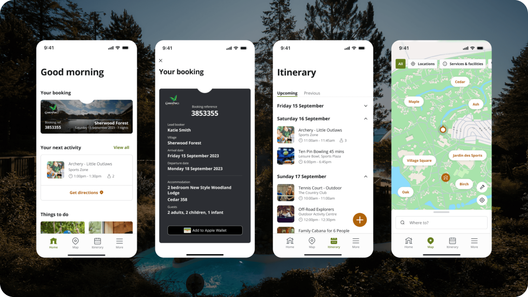
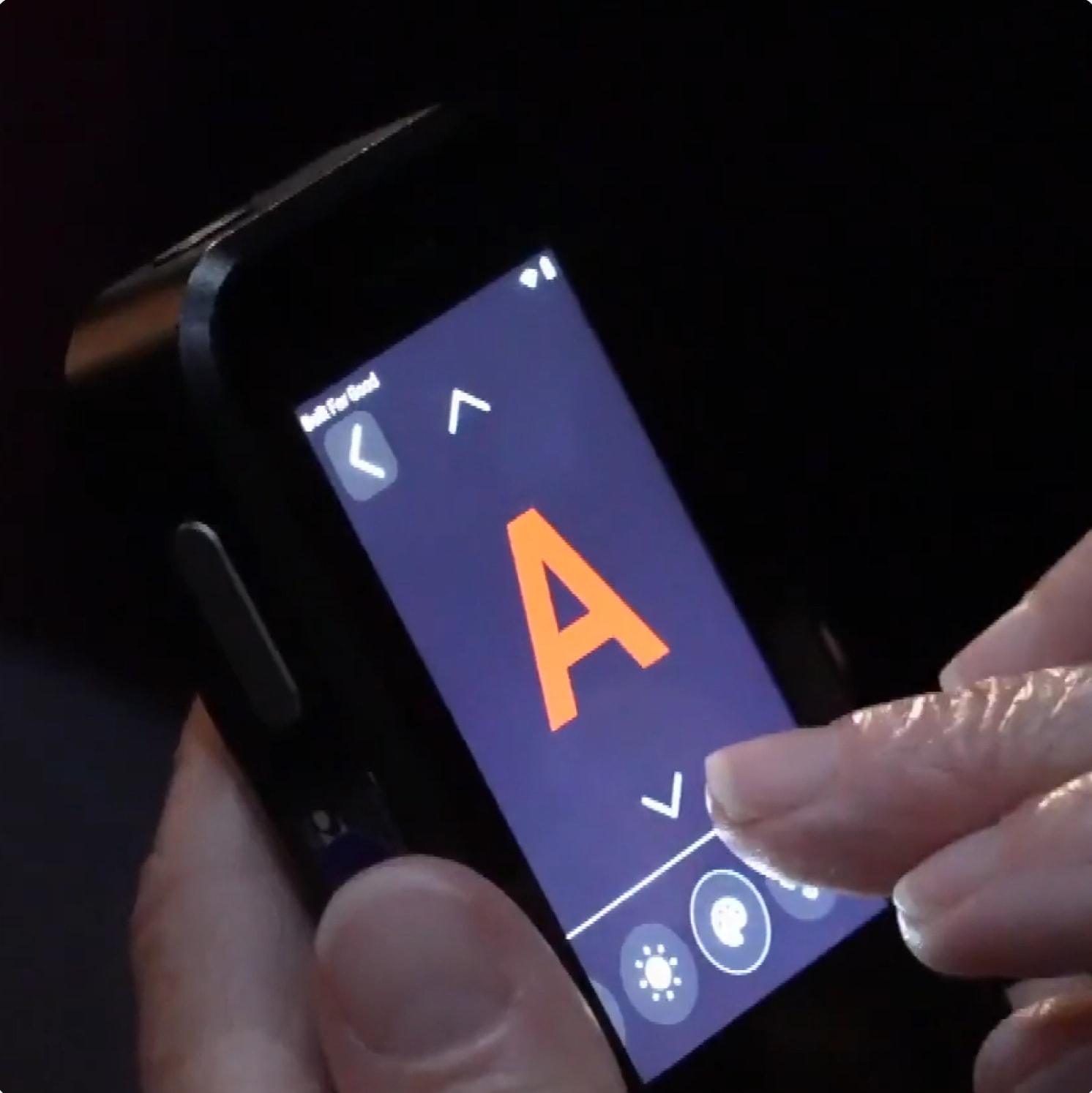
Accessibility was also a major focus of the app’s development, with features like light and dark modes and rigorous accessibility testing baked into the development process to ensure inclusivity and ease of use for all guests.