Center Parcs

Putting customers at the heart of the experience

Center Parcs, a leading UK leisure brand, partnered with Atomic to enhance the online booking experience across their main customer websites. A core focus was improving the pre-arrival planning journey, allowing guests to easily manage check-in and organise all attendees within their holiday booking, ultimately delivering a seamless and user-friendly digital experience.

Three women dressed in winter clothing smile and raise glasses of white wine together outdoors, enjoying a cheerful moment in warm, cozy lighting.

The Atomic team are brilliantly collaborative and always champion UX best practice, putting the customer at the heart of all design decisions. It’s always a pleasure to work with them.

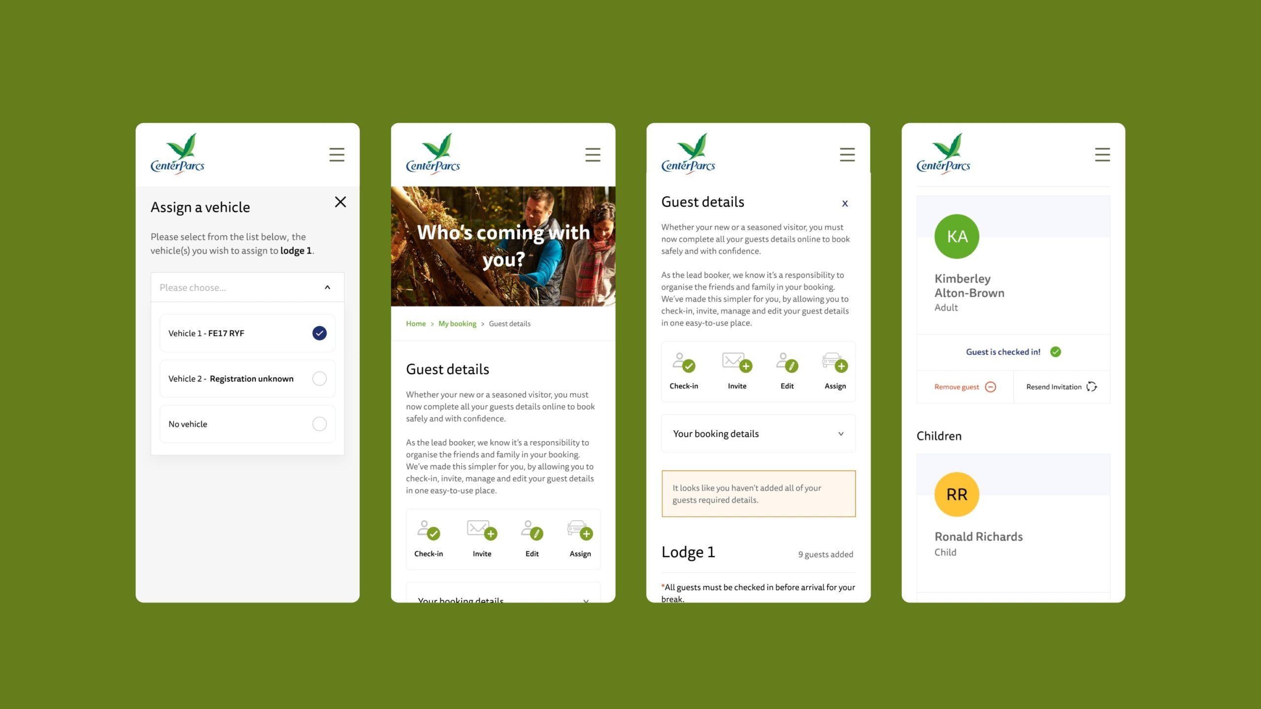
Four mobile app screens with a green background display forms and details for assigning a vehicle, entering guest information, and confirming guest details for a lodge booking. Icons and text fields are visible throughout.

The challenge

Simplifying pre-arrival guest management

Center Parcs tasked Atomic with optimising the crucial step of guest check-in and organisation before arrival.

The existing user journey needed to be streamlined so customers could quickly and effortlessly manage all guests included in their holiday booking, ensuring a hassle-free start to their getaway.

A man and a young boy sit by a large window in a cozy wooden room. The boy touches the glass and gazes outside with curiosity, while the man looks out thoughtfully, holding the boy on his lap.
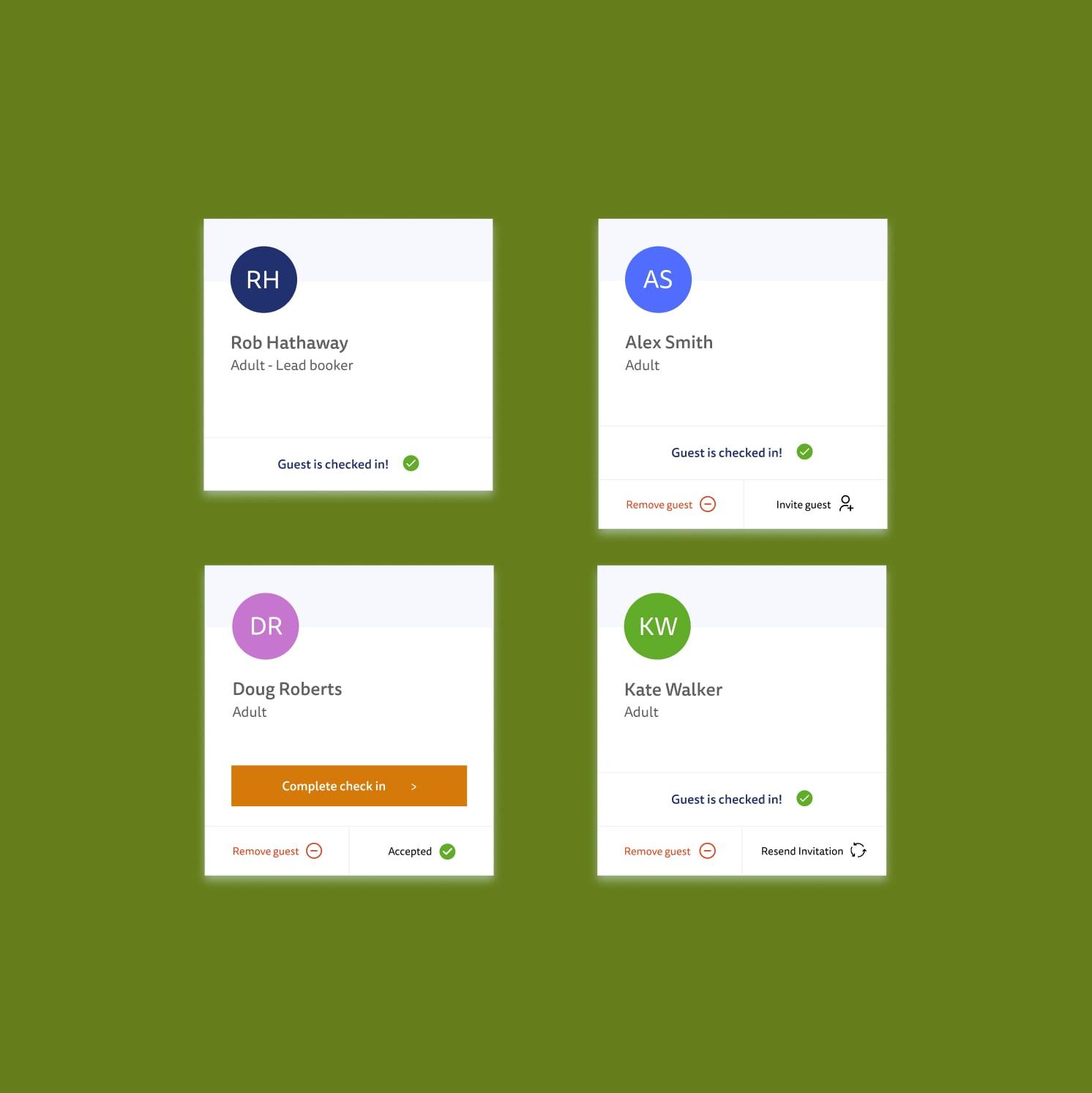
A green background displays four user profile cards with names, initials, and guest status indicators, including “Guest is checked in!” and “Complete check in” buttons, and status icons.

The solution

User-centered research and iterative design

Our process began with deep research into the UK market and target audience digital habits.

We conducted comprehensive user testing with both current and prospective Center Parcs customers to uncover pain points in the existing guest details journey. These insights shaped the redesign of the user experience, which was then rigorously validated through further testing.

Finally, the UI was developed to align with Center Parcs’ established digital identity, ensuring brand consistency and visual appeal.

Four guest check-in cards with names, status buttons, and colored initials: Rob Hathaway (checked in), Alex Smith (checked in, invite guest), Doug Roberts (check-in pending), and Kate Walker (checked in, resend invitation).
Four icons: a person with a green check, a person with a green pencil, an envelope with a green plus, and a car with a green plus, all on a light gray background.
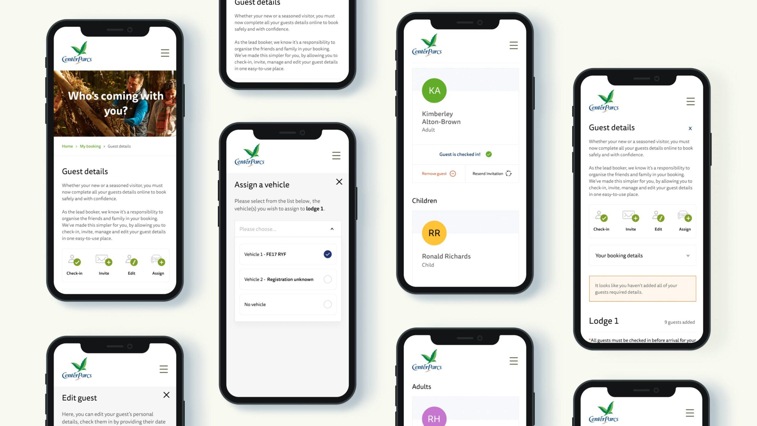
Eight smartphones display various screens of a guest management app, showing guest details, vehicle assignment, guest lists, adults and children, and an edit guest form, all with a clean, modern interface on a light background.

The outcome

Improved UX driving higher pre-arrival engagement

The redesigned guest details journey exceeded all UX goals and KPIs.

Post-launch, the number of guests completing pre-arrival check-in increased significantly beyond previous levels. By analysing each step of the process, we identified pain points and small improvements, which guided our creation of clear UX goals.

Combining moderated and remote testing, we tracked successes and areas for refinement, ensuring a continuously improving, customer-focused experience.

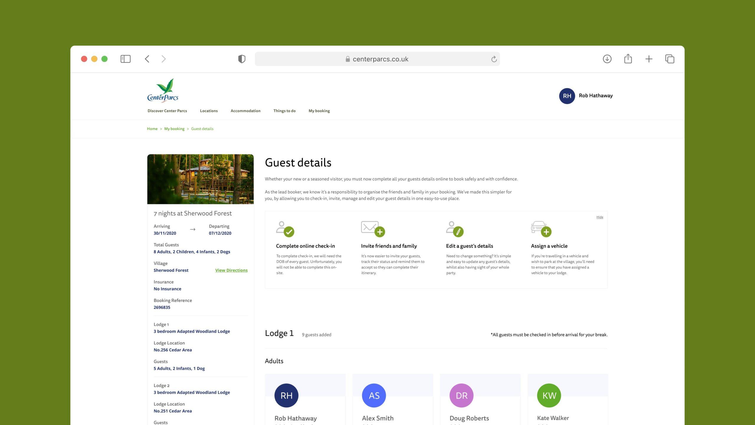
A screenshot of a Center Parcs booking webpage displays guest details for a lodge, including icons and instructions, guest names, and profile circles, with a green browser header at the top.