Design
Is Apple’s new ‘Dynamic Island’ a UX improvement?
Since the release of the new iPhone 14 last month, there has been quite a buzz in the design community, with opinions being split on whether this is a good or bad move from a UX perspective…while others see it as simply a very clever PR idea to get people talking. Well it’s certainly got our design team talking! Our recent research points to it being received with some scepticism, with the vast majority of respondents (60%) feeling it was primarily a very clever PR idea.
But what’s all the fuss about and what does the new Dynamic Island really mean for the user?
What is the Dynamic Island?
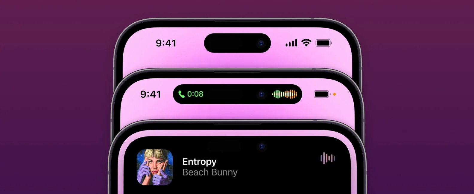
The Dynamic Island is part of the latest design for the iPhone 14 Pro and replaces the notch that Apple introduced back in 2017.
The notch was originally introduced to maximise the available screen space and hide any unnecessary elements. But with the Dynamic Island, Apple has taken things one step further. The Dynamic Island is a pill-shaped cutout that can change shape and size to display alerts and notifications. This allows for even more screen space to be used, whilst providing a more aesthetically pleasing design.

Why is it needed?
Apple has always been a company that does things its own way and leads the industry in new innovations; and their ‘Face ID’ facial recognition system is no exception. While other Android devices use a ‘dot’ design which, yes, takes up less space, this only provides 2D facial recognition, which simply compares a user’s face to the photo they registered with, but it’s easy to fool this technology.
Apple has taken security one step further, using additional sensors to create a 3D facial map. These sensors include a dot projector, to project a grid of tiny infrared dots onto a user’s face, a flood illuminator that shines infrared light at the face, and an infrared camera that takes an infrared picture of the user. It is then able to read the resulting pattern and creates a 3D facial map, which is much more secure.
These additional sensors require more room than the ‘dot’ provides, hence the need for the notch, and now Dynamic Island.

What are the UX benefits of the Dynamic Island?
Although necessary to add additional security for users, feedback on the notch was that users felt it got in the way. So Apple looked at how they could use this space differently, to offer a better user experience. Their solution to this was the Dynamic Island, which offers user:
Stunning motion design: During a presentation by Apple for the iPhone 14 Pro, the company showed off a beautiful selection of transitions. It’s one of the most advanced motion languages recently developed and has the potential to leave a great first impression on users.
Great user interface: When in full-screen mode, a portion of the screen was always obscured by the notch. Because of the notch’s physical restrictions, it was impossible to prevent this. However, Apple has attempted to overcome this, merging it into one pill-shaped area that changes size and shape to accommodate various types of timely alerts, updates, notifications and interactions, turning it into an information hub that could change user perceptions of this area.
A new layer to the user interface (UI): It allows users to receive timely updates in a less intrusive way, replacing the often distracting pop-up notifications that can get in the way of what you’re trying to do on your phone. For example; you could check your email and still see how your favourite sports team is doing or keep track of how far away your Uber is, while using other apps. This is a great additional use for Dynamic Island.
Are there any UX disadvantages of the Dynamic Island?
Although the new Dynamic Island brings with it some potential UX improvements, there are also areas where the user experience may be compromised.
Accessibility: Best practice for UX is to locate key interaction features at the bottom of the screen, as most people use their phone with one hand, holding it at the bottom. Many people argue the phone is already too big in their hand and so this feature will make it even harder for them to use in their chosen way.
So although the Dynamic Island allows users to interact with it using their fingers, its position in a hard to reach place will make interaction with it less comfortable for some users and will often mean users will have to adjust their grip of the phone in order to access the feature.

From a design perspective, the relatively small size of Dynamic Island prevents designers from adjusting the element sizes to produce appropriate content sections. So, users may struggle to see the content on Dynamic Island as the size is not adjustable.
Blurry front camera:Users will now continuously tap around the front-facing camera that is built into the Dynamic Island. This is likely to cause users to have blurry selfies and videos recorded on the front camera as a result of finger taps smudging the lens. This could frustrate some users and it could be argued that this wasn’t carefully thought out when designing the feature.
Visible elements: The OLED screen on the iPhone 14 Pro enables the creation of pure black colour. Apple’s marketing materials depicted the Dynamic Island as having the appearance of a solid, pure black pill, but in practice, it might not. The space between spots can be seen, and in direct sunlight, it is even easier to see. This is not the best user experience when the individual elements are visible. This could also affect the user’s experience when in full-screen video mode as the screen’s side hole will be continuously noticed.
It could annoy users: The animated transitions in the Dynamic Island can be very attention-grabbing and requires a lot of user attention each time it activates. App developers will need to be careful not to overuse this feature as it could become very annoying and risk losing users.
Our thoughts
Whilst it does present some groundbreaking motion design, showcasing why Apple always sets the standard for the industry; as a UX design team we can’t help but think it’s form over function and more of a marketing decision than good UX thinking.
There were a limited number of new features to promote with the latest iPhone release, so focusing on the Dynamic Island allowed Apple to differentiate themselves from the competition and also got people talking!
Overall, we feel the new Dynamic Island serves to make people associate useful functionality (better status display) with an anti-feature that is arguably unnecessary for that functionality and could be seen to actually hinder it. But that’s the power of marketing, and let’s face it, Apple does it better than anyone else!

Head of Design
Published
31 October, 2022
More stories, news and insights…

__ Insights
Choosing the right app & web design agency
Today's market certainly isn't short of digital agencies, so how can you make sure you choose the best?

__ Insights
How machine learning can boost your marketing
Why you need to understand machine learning and how can you use it to boost your digital marketing performance?

__ Team
It’s the people that power Atomic
What makes Atomic a great place to work...let's ask someone who's been here 10 year!

__ Team
Getting to know… Cara Thresh, Product Owner
As well as her excellent Product Owner experience, Cara is also an experienced Scrum Master and Frontend & Backend Developer.